Supermono
Client
Supermono
Location
Singapore
Expertise
Brand Identity
Art Direction
Logo Design
Brand Guidelines
Stationary System
Marketing Collateral
Status
Ongoing


Supermono is a Singapore-based interior design studio known for its refined, minimalist spaces and thoughtful spatial storytelling. Their philosophy is rooted in clarity, structure, and a pared-back aesthetic that gives form to functionality.
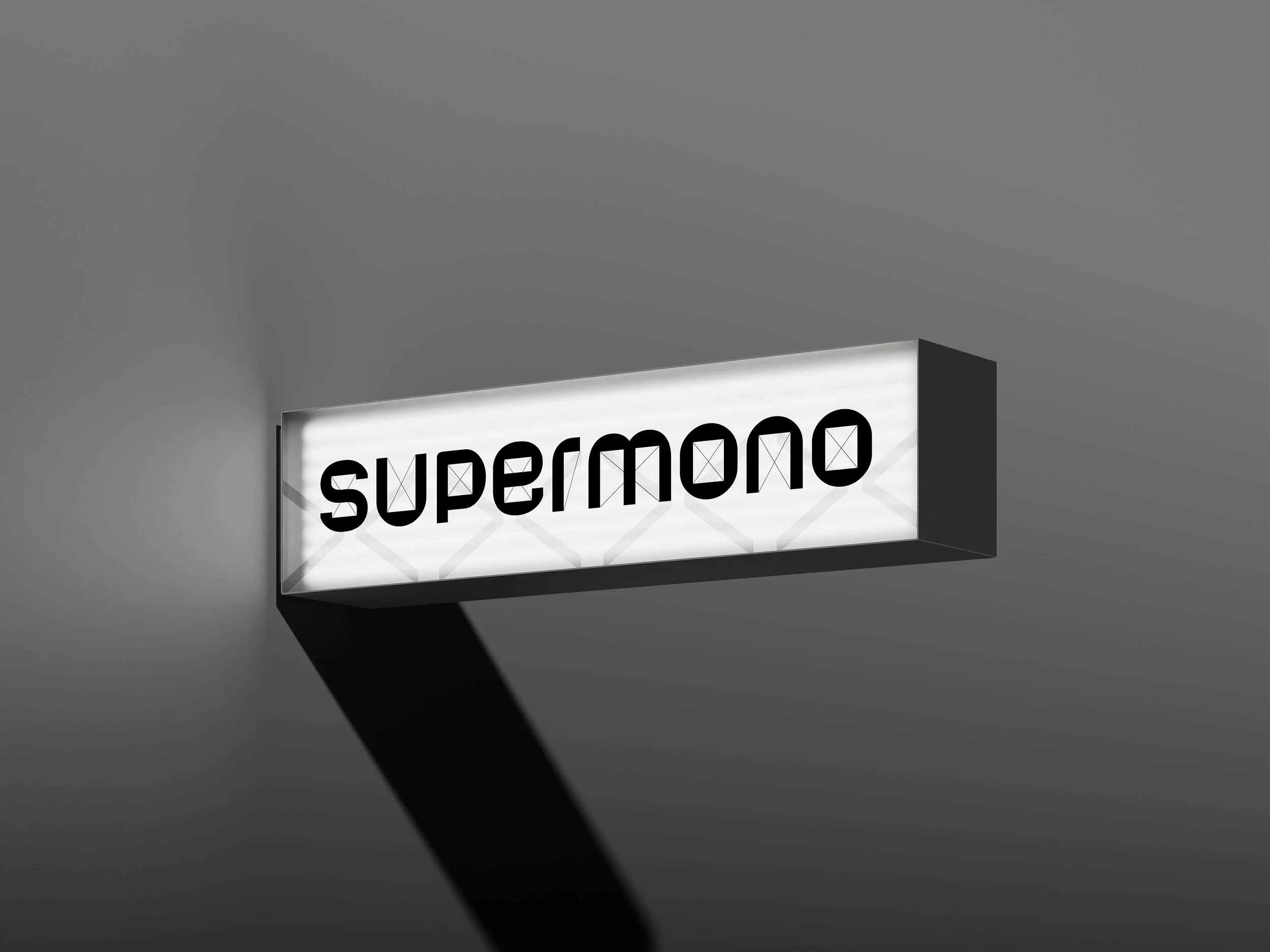
The Supermono logo draws inspiration from architectural floor plans and technical drawings, aligning with the studio’s interior design focus. Each letterform in the logotype is designed with measured linework and a structured rhythm, echoing the grid-based logic and order found in spatial planning.
With a monospaced feel and sharp geometric construction, the logo balances creative expression with precision. It suggests methodical thinking and a clear design process while remaining distinctly modern and minimal.

Supermono’s corporate identity system extends the brand’s floor plan-inspired logotype into a cohesive suite of stationery and collateral. The design emphasizes clarity, consistency, and refined minimalism—hallmarks of the studio’s architectural approach.
Every element—from the type treatment on letterheads and business cards to the custom-branded pencils and tubes—is purposefully restrained, using a monochromatic palette and generous white space. This gives the materials a calm, confident presence that reflects the studio’s aesthetic and professionalism.
Subtle typographic hierarchy, grid alignment, and precise spacing mirror the drafting discipline found in interior design. Branded buttons and packaging elements add a tactile, collectible dimension—underscoring Supermono’s attention to detail and care in presentation.
This identity system doesn’t just communicate; it creates a unified experience across every touchpoint, reinforcing Supermono’s design philosophy in both form and function.
-
![A smartwatch with a yellow band on a person's wrist displaying a bus icon and a plus sign.]()
LevelUP
-
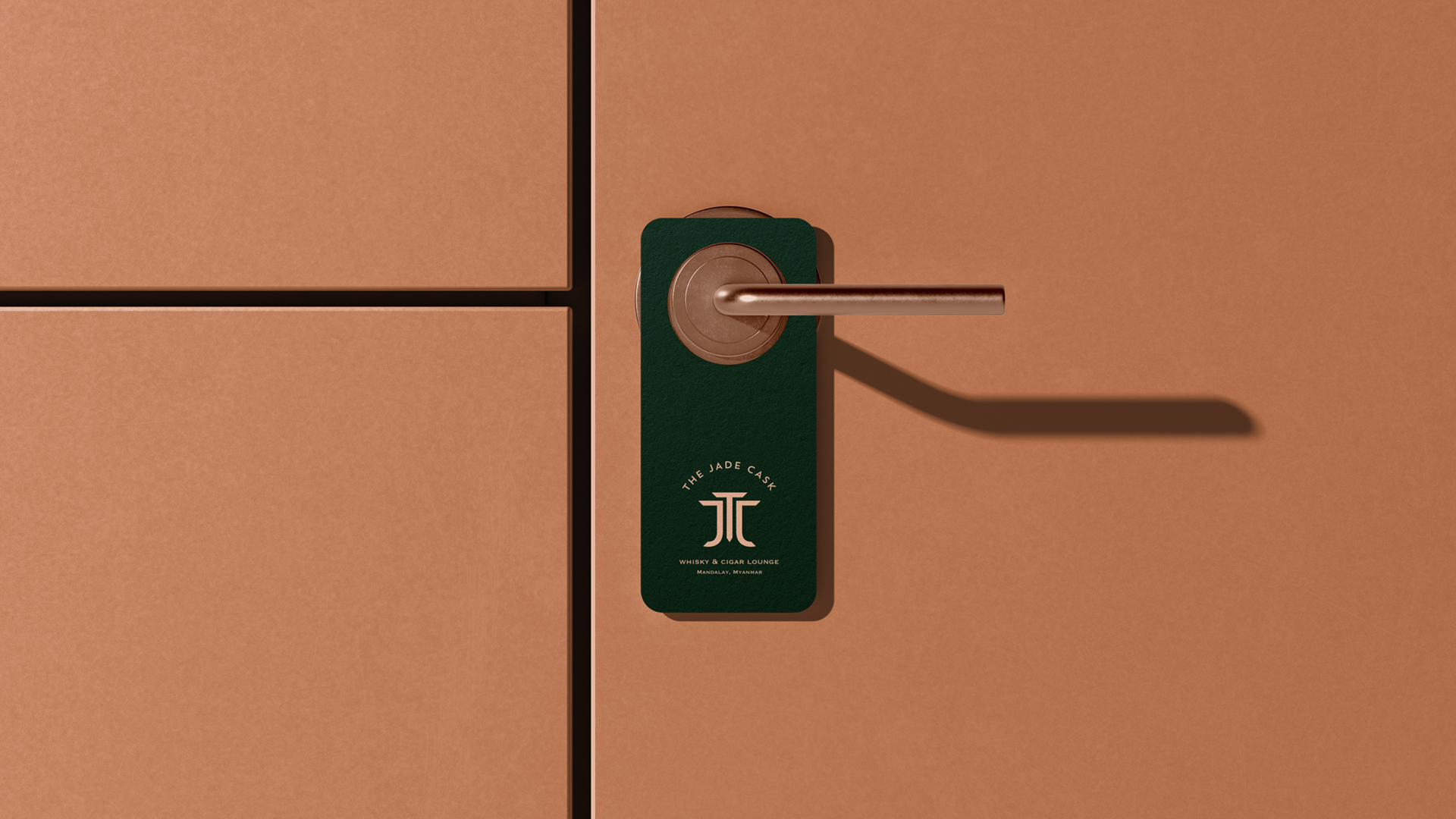
![Close-up of a copper-colored door handle and lock with a green tag labeled 'The Jade Cask' from Myanmar.]()
The Jade Cask
-
![Multiple white boxes of the 'White Clinic Deep Cleansing Mask' arranged on a surface, with product description and branding on the packaging.]()
White Clinic
-
![A large group of runners at the start line of a night marathon race, held in multiple countries including Singapore, Malaysia, Thailand, Hong Kong, Indonesia, and China. The runners are ready to begin, illuminated by night lighting. The start line has a message that reads "FREE YOURSELVES" in bright letters, and above is a banner with the Yolorun logo.]()
YOLO Run
-
![A black fabric with gold geometric and graphic designs, hanging on a horizontal rod.]()
Salesforce
-
![A silver Alfa Romeo car with a black roof and gold decals, including the words "Run Free" and the Alfa Romeo logo, parked on a concrete surface.]()
Run Free
-
![Close-up of a cooked steak on a grill with flames in the background and a food logo overlay that says 'Nics Kitchenette.']()
Nic's Kitchenette
-
![Image featuring a logo for Ethan's Gourmet Foods over a background of fresh vegetables including lettuce and squash, with a rustic wooden shelf and baskets of tomatoes in a market or farm stand setting.]()
Ethan's Gourmet
-
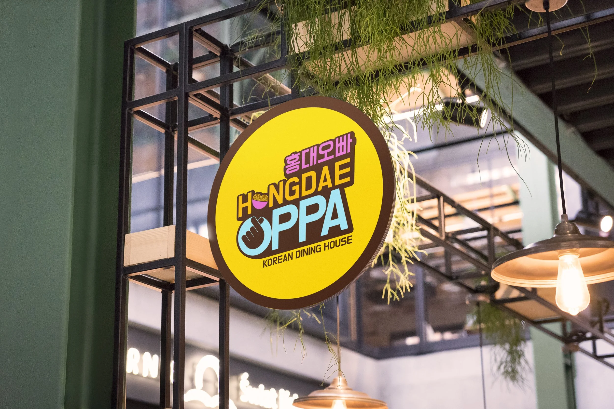
![Sign for Hongdae Oppa, a Korean dining house, hanging from ceiling with plants and lighting in the background.]()
Hongdae Oppa
-
![Leong Lawrence logo with tagline 'The Link to Financial Security' and Great Eastern branding on a blue gradient background.]()
Leong Lawrence
-
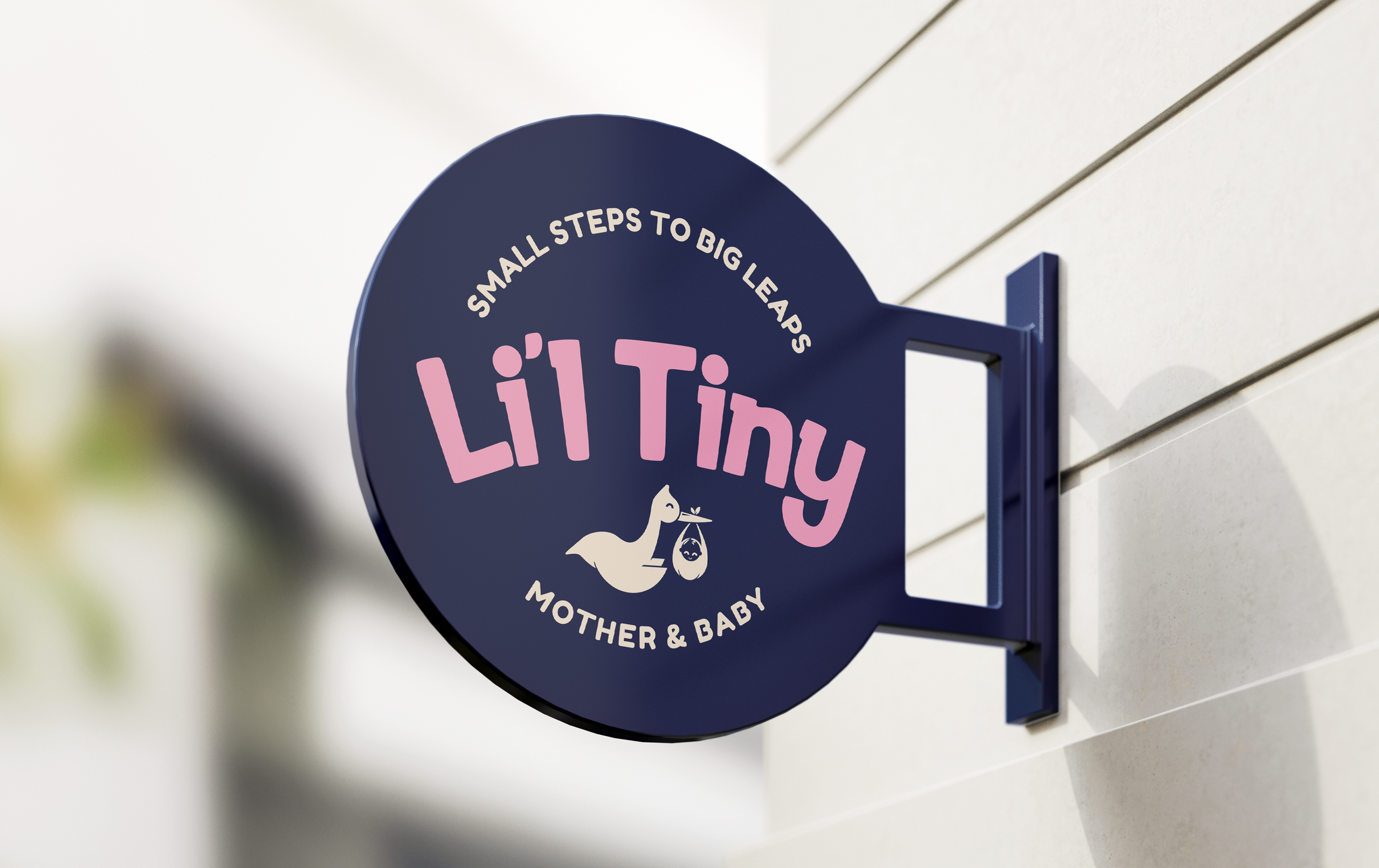
![A circular store sign on a wall reads, 'Small steps to big leaps, Lil' Tiny Mother & Baby,' with a logo of a duck carrying a bag.]()
Li'l Tiny
-
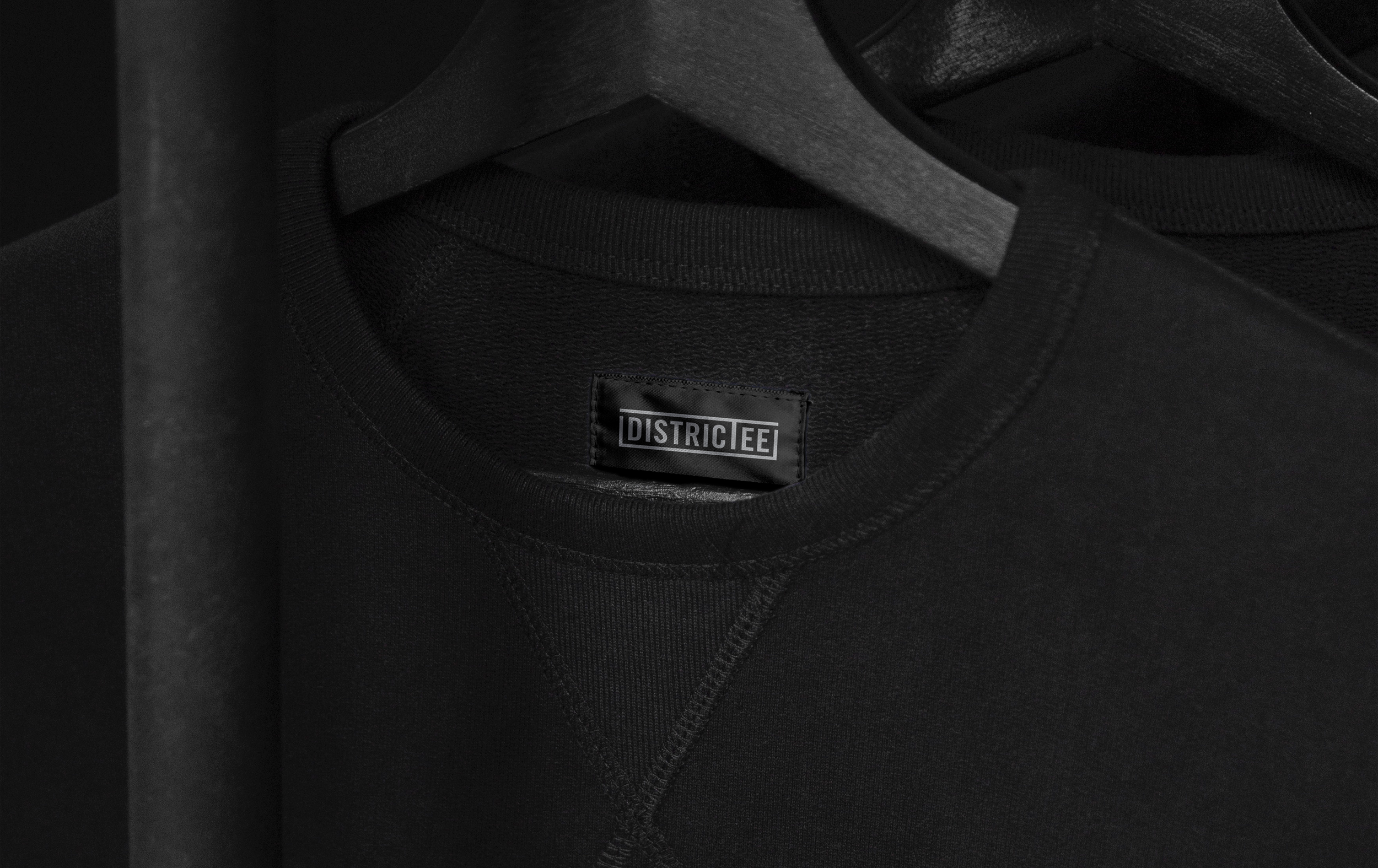
![Close-up of a black T-shirt with a label that reads 'DISTRICT EE' inside the neckline, hanging on a dark hanger.]()
Districtee
-
![Event tickets for DreamWorks' 'Dragons' showing the date June 24, 2017, and featuring images of characters Toothless, Shrek, Kung Fu Panda, and a panda cub, along with details of the event location and time.]()
DreamWorks Day
-
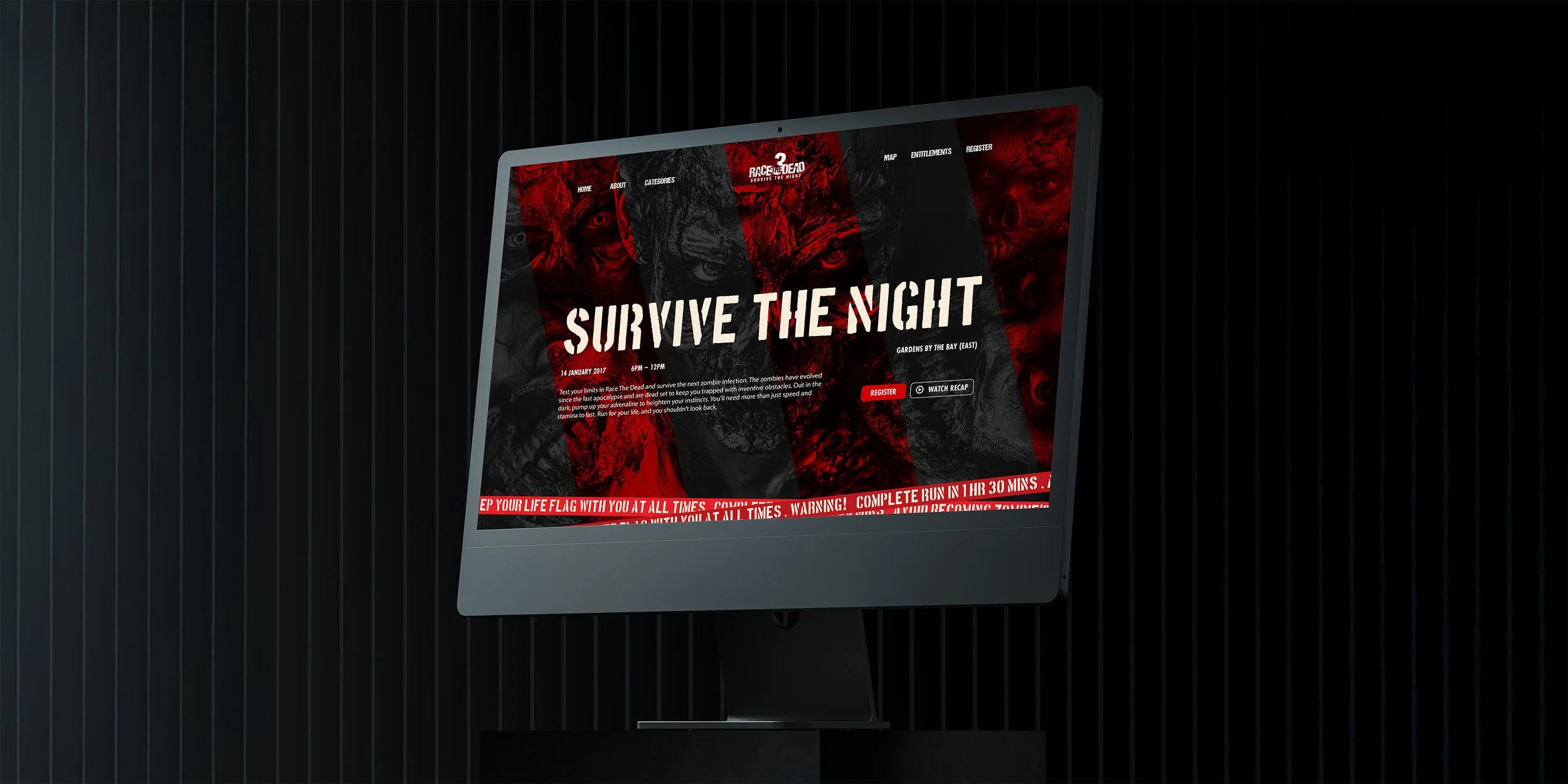
![Computer screen displaying a website for a zombie-themed event called 'Survive the Night' with dark and red colors, featuring text about the event details and registration options.]()
Race The Dead
-
![Two SpongeBob-themed cups, one yellow with SpongeBob's face and one pink with Patrick's face, placed on a blue box featuring the SpongeBob SquarePants logo and text.]()
SpongeBob Run
-
![A grayscale modern building with a large red steaming cup icon with a downward arrow in the center.]()
Hwa Chong International School
-
![Two packets of spices, coriander powder and red chili powder, floating above a beige surface with a black background.]()
Anjali's Curry
-
![A close-up of a blue card with a shiny silver 'W' logo on it, with a dark background and subtle lighting effects.]()
Willet Partners
-
![Illuminated rectangular sign with the word 'supermono' in bold black letters on a light background, casting a shadow on a plain wall.]()
Supermono