Anjali’s Curry
Client
Direct Search Global
Location
Singapore
Expertise
Brand Identity
Art Direction
Logo Design
Brand Guidelines
Packaging Design
Status
Completed


Anjali’s Curry is a heritage food brand rooted in the culinary traditions of Tanjore, South India. Built on generations of perfected recipes, Anjali’s brings the authentic and distinctive flavours of South Indian cuisine from supermarkets straight into home kitchens using only the finest blends of ground spices.
The Vessel Studio was tasked with creating a brand identity system and packaging suite that would honour this legacy, while giving the brand a clean, globally relevant presentation suited for modern retail.
The brand was developed to reflect authenticity, warmth, and generational pride. Rather than lean into decorative stereotypes, the focus was on storytelling through colour, symbolism, and layout that felt personal and contemporary.
Anjali’s brand voice is rooted in tradition but speaks with modern confidence: welcoming, knowledgeable, and always food-first.
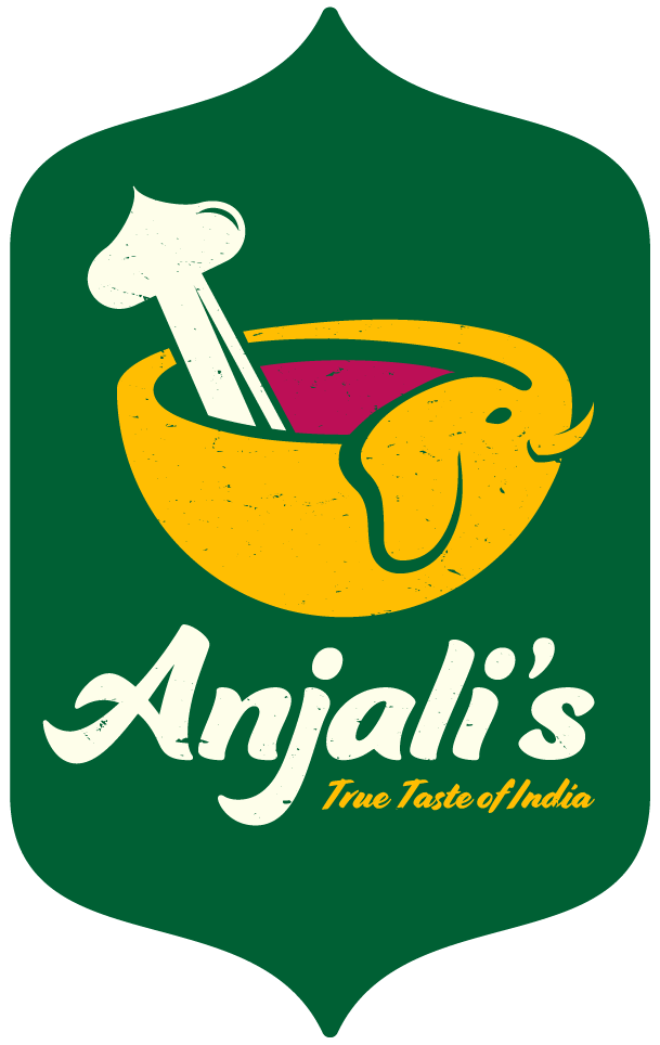
The Anjali’s logo is a symbolic celebration of Indian culture and culinary roots. It features an abstract emblem inspired by a (mortar and pestle), a traditional spice-grinding tool. The mortar is shaped like an elephant, representing strength, heritage, and Indian symbolism, while the pestle is formed like an bulbous dome , echoing Indian architecture.
Together, they form a unified, iconic symbol that reflects the craft and cultural depth of the brand.
The accompanying logotype is set in a refined serif, balancing clarity and character. The identity uses a palette of spice-inspired colours like red, white, yellow and green, each nodding to the vibrancy of Indian cuisine and the ingredients within.
In Indian culture, each of these colours holds significant symbolic meaning: (Red) represents auspiciousness, passion, and love, (Yellow) signifies knowledge, learning, and prosperity, (Green) evokes new beginnings, fertility, and nature and (White) conveys purity, peace, and spirituality
These colour choices do more than decorate, they enrich the brand with deeper cultural context.

Anjali’s visual identity bridges heritage and modernity, creating a culturally grounded brand system that feels at home both in the supermarket aisle and on a gourmet kitchen shelf. The brand celebrates tradition while inviting a new generation of home cooks to discover the richness of South Indian flavours.
A rich, story-driven identity that honours generations of spice-making while confidently stepping into today’s global food scene. Anjali’s brings more than flavour. It brings legacy, warmth, and authenticity to every meal.


