Nic’s Kitchenette
Client
Nic’s Kitchenette
Location
Singapore
Expertise
Brand Identity
Art Direction
Logo Design
Marketing Collateral
Packaging Design
Status
Completed
Nic’s Kitchenette is a private home dining concept where food is lovingly prepared for curated events and individuals. Known for its cozy, home-cooked meals and intimate experiences, the brand wraps every dish in a bold and inviting visual identity. Inspired by vintage diner aesthetics with a modern twist, the branding is playful, nostalgic and crafted to deliver memorable dining moments.
The Vessel Studio was engaged to craft a full brand identity system that would feel honest, welcoming, and down-to-earth. One that would shine both in-person and across Nic’s strong social media presence, where food and events are showcased with warmth and flair.
Nic’s Kitchenette is about bringing a sense of home to private dining. It bridges the gap between convenience and heartfelt, homemade cooking. Serving food with personality and purpose. The brand needed to feel approachable and personal, practical yet well-designed and suitable for private events, celebrations, and one-of-a-kind gatherings.
Our direction leaned into nostalgic warmth and kitchen authenticity, with a clean execution that ensured readability and versatility.

Nic’s Kitchenette is about bringing a sense of home to private dining. It bridges the gap between convenience and heartfelt, homemade cooking—serving food with personality and purpose. The brand needed to feel:
Approachable and personal
Practical yet well-designed
Suitable for private events, celebrations, and one-of-a-kind gatherings
Our direction leaned into nostalgic warmth and kitchen authenticity, with a clean execution that ensured readability and versatility. and kitchen authenticity, with a clean execution that ensured readability and versatility.

-
![]()
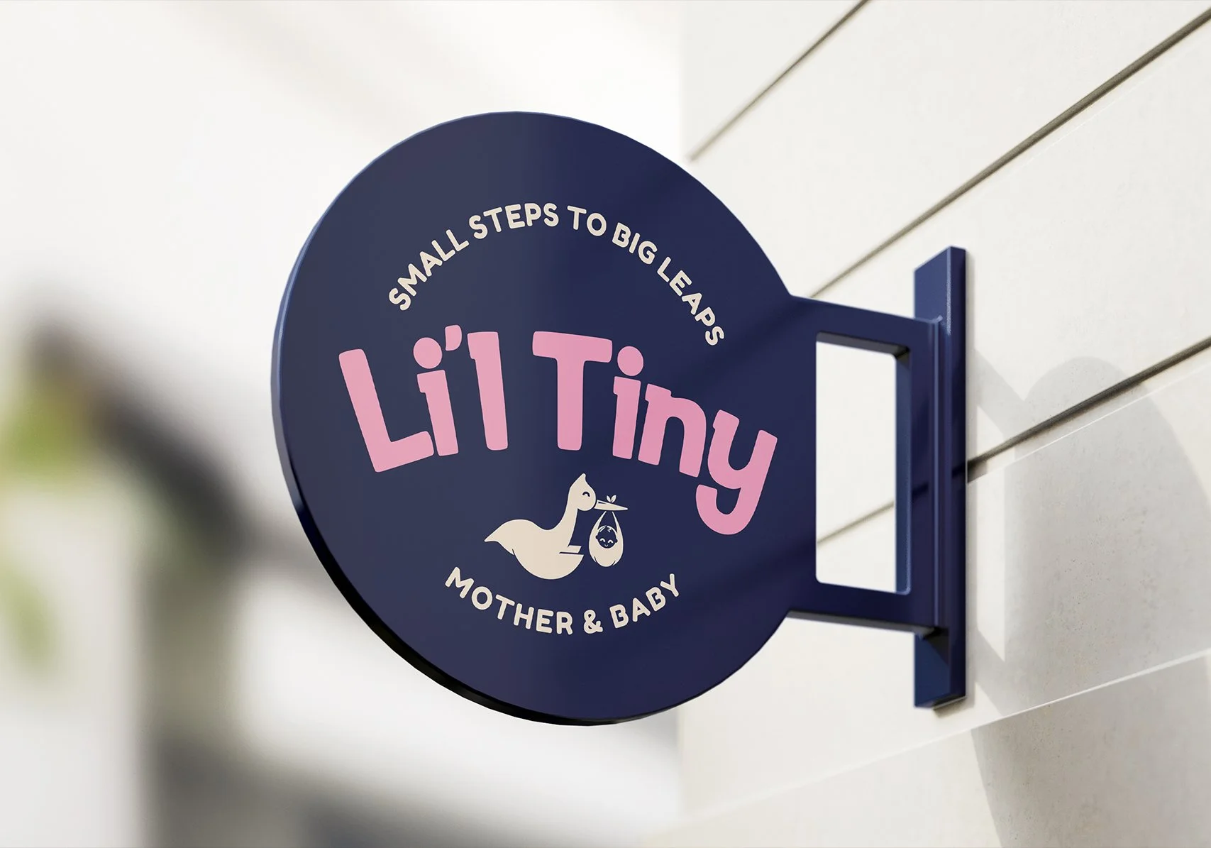
Li'l Tiny
-
![]()
Ethan's Gourmet
-
![]()
Race The Dead
-
![]()
Districtee
-
![]()
Hongdae Oppa
-
![]()
SpongeBob Run
-
![]()
Hwa Chong International School
-
![]()
Anjali's Curry
-
![]()
Willet Partners
-
![]()
Supermono
-
![]()
LevelUP
-
![]()
The Jade Cask
-
![]()
White Clinic
-
![]()
YOLO Run
-
![]()
Salesforce
-
![]()
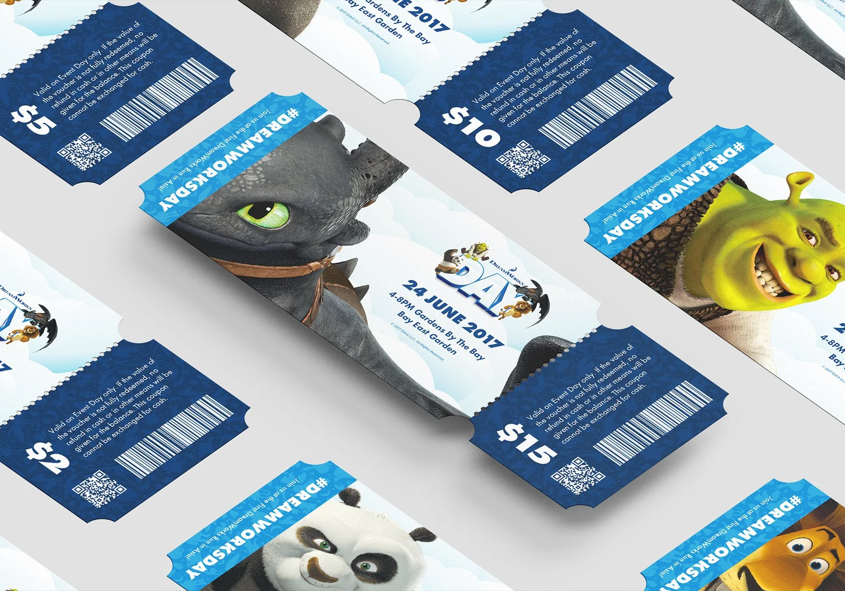
DreamWorks Day
-
![]()
Run Free
-
![]()
Leong Lawrence
-
![]()
Nic's Kitchenette