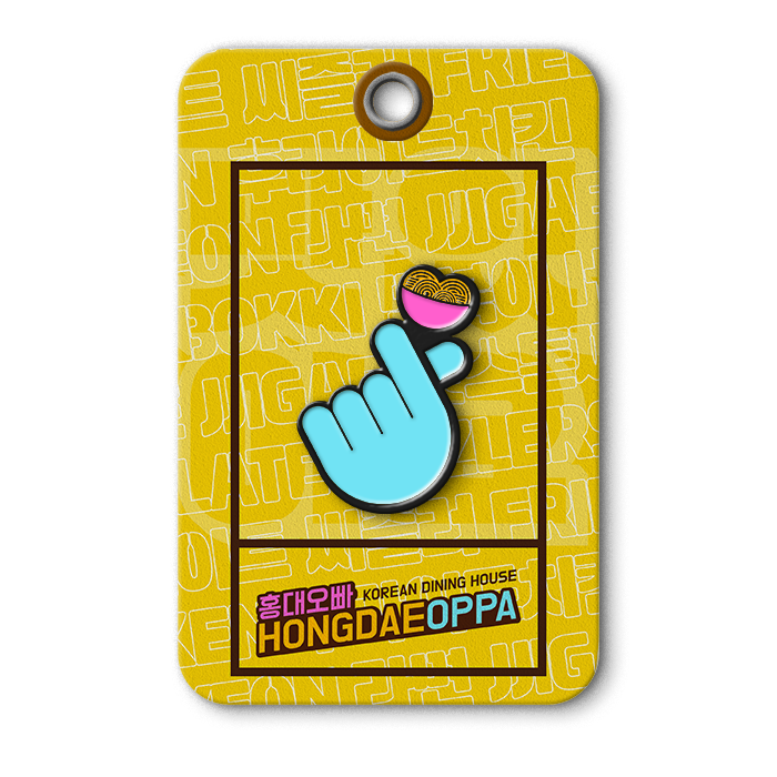
Hongdae Oppa
Client
Seonggong Pte Ltd
Location
Singapore
Expertise
Brand Identity
Art Direction
Logo Design
Brand Guidelines
Marketing Collateral
Packaging Design
Status
Completed

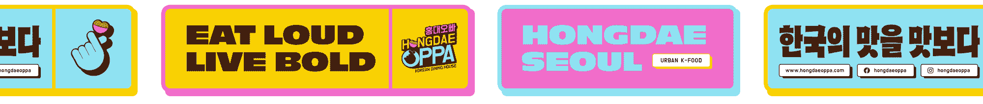
Hongdae Oppa is a vibrant Korean dining house inspired by the electric charm of Hongdae, Seoul’s trendiest cultural hub. Our brand identity was crafted to capture that youthful, energetic spirit: bold, playful, and undeniably K-cool.
The Vessel Studio was brought on to develop a full brand identity system that would embody the visual attitude of Hongdae: loud, poppy, sticker-covered, and brimming with personality.
Hongdae Oppa needed a brand identity that captured the bold, expressive personality of modern Korean youth culture—one that would appeal to both Gen Z and millennial diners while standing out in Singapore’s saturated F&B landscape with a fresh, energetic voice.
Our design strategy focused on creating a visual playground: inspired by K-pop, street fashion, graffiti, and the sticker-bombed walls of Seoul’s youth districts. The result is a brand identity that feels expressive, poppy and rooted in urban nostalgia, drawing heavily from the colourful, chaotic charm of Hongdae’s art, music, and playful street style.

The Hongdae Oppa logo is a bold, expressive mark that captures the vibrant attitude of Korean youth culture, with layers of symbolism designed to evoke both emotional and cultural resonance. A playful and high-energy typographic treatment mixes English and Hangul (홍대오빠), bridging Korean authenticity with global accessibility. The angled layout adds dynamism and a sense of movement—much like the bustling streets of Hongdae. The ramyeon bowl nestled in the “O” of "HONGDAE" is cleverly shaped like a heart, creating a subtle visual pun that mirrors the iconic finger heart in the “O” of "OPPA." Together, these symbols form a dual heart motif—reinforcing themes of warmth, affection, and food made with love. The finger heart, a gesture popular in K-pop culture, serves as a nod to modern Korean expression and connection, making the brand feel immediately familiar and relatable to younger audiences. A high-contrast mix of sunny yellow, neon magenta, and sky blue channels the lively street culture of Seoul, while rich chocolate brown grounds the palette and enhances legibility.

-
![White SpongeBob SquarePants T-shirt floating in a swimming pool]()
SpongeBob Run
-
![A line drawing of modern buildings and outdoor seating area with umbrellas, overlaid with a red icon representing heat or warmth.]()
Hwa Chong International School
-
![Three packets of Anjali's spice powders: Briyani Masala, Chicken Curry, and Mutton Masala, placed on a beige surface against a black background.]()
Anjali's Curry
-
![Close-up of a navy blue card with a silver 'W' logo.]()
Willet Partners
-
![Backlit sign with the word "supermono" in black stylized letters on a white background]()
Supermono
-
![A smartwatch with a yellow strap shows a black screen with a yellow logo of a stylized letter 'L' combined with a plus sign, worn on a person's wrist.]()
LevelUP
-
![Close-up of a door handle with a green tag that reads 'The Jade Cask Whisky & Cigar Lounge, Mandalay, Myanmar' on a beige-colored door.]()
The Jade Cask
-
![Multiple white boxes of 'White Clinic' Deep Cleansing Mask arranged on a surface.]()
White Clinic
-
![Crowd of runners at the starting line of the Yolo Run race event at night. The banner overhead displays the Yolo Run logo and locations including Singapore, Malaysia, Thailand, Hong Kong, Indonesia, and China. The ground features the phrase "Free Yourselves" in yellow.]()
YOLO Run
-
![Black and gold fabric with geometric patterns hanging on a metal rod.]()
Salesforce
-
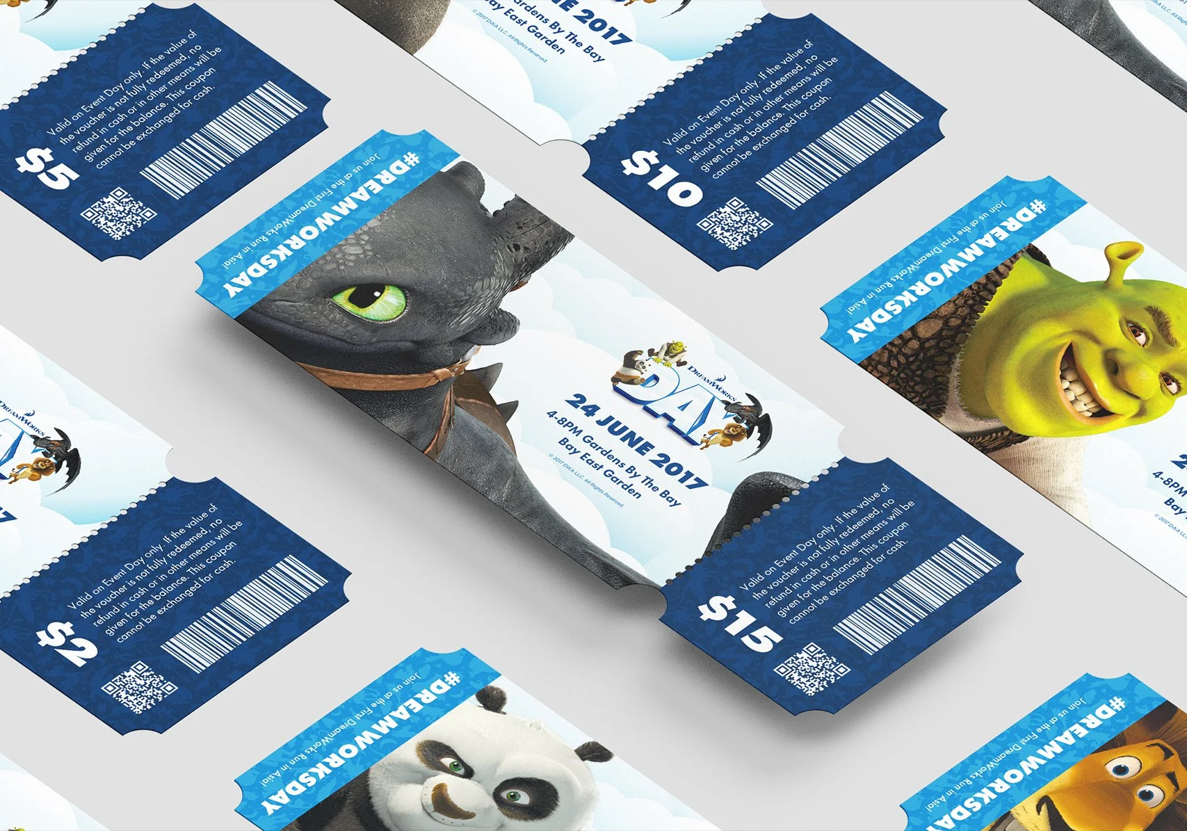
![Multiple tickets for a DreamWorks event featuring characters from animated movies, including a dragon, Shrek, a panda, and a horse, with event details and QR codes.]()
DreamWorks Day
-
![Silver Alfa Romeo hatchback car with black roof, black tinted windows, and gold 'RUN FREE' and 'F' logos on the sides and hood, parked on a plain light gray background.]()
Run Free
-
![Blue presentation slide with white text and logo for Leong Lawrence, titled "The Link to Financial Security," alongside a logo for Great Eastern.]()
Leong Lawrence
-
![A close-up of a cooked piece of meat being grilled over flames with a logo overlay reading "Nics Kitchenette, Food taste better when it's home made, Circa 1979."]()
Nic's Kitchenette
-
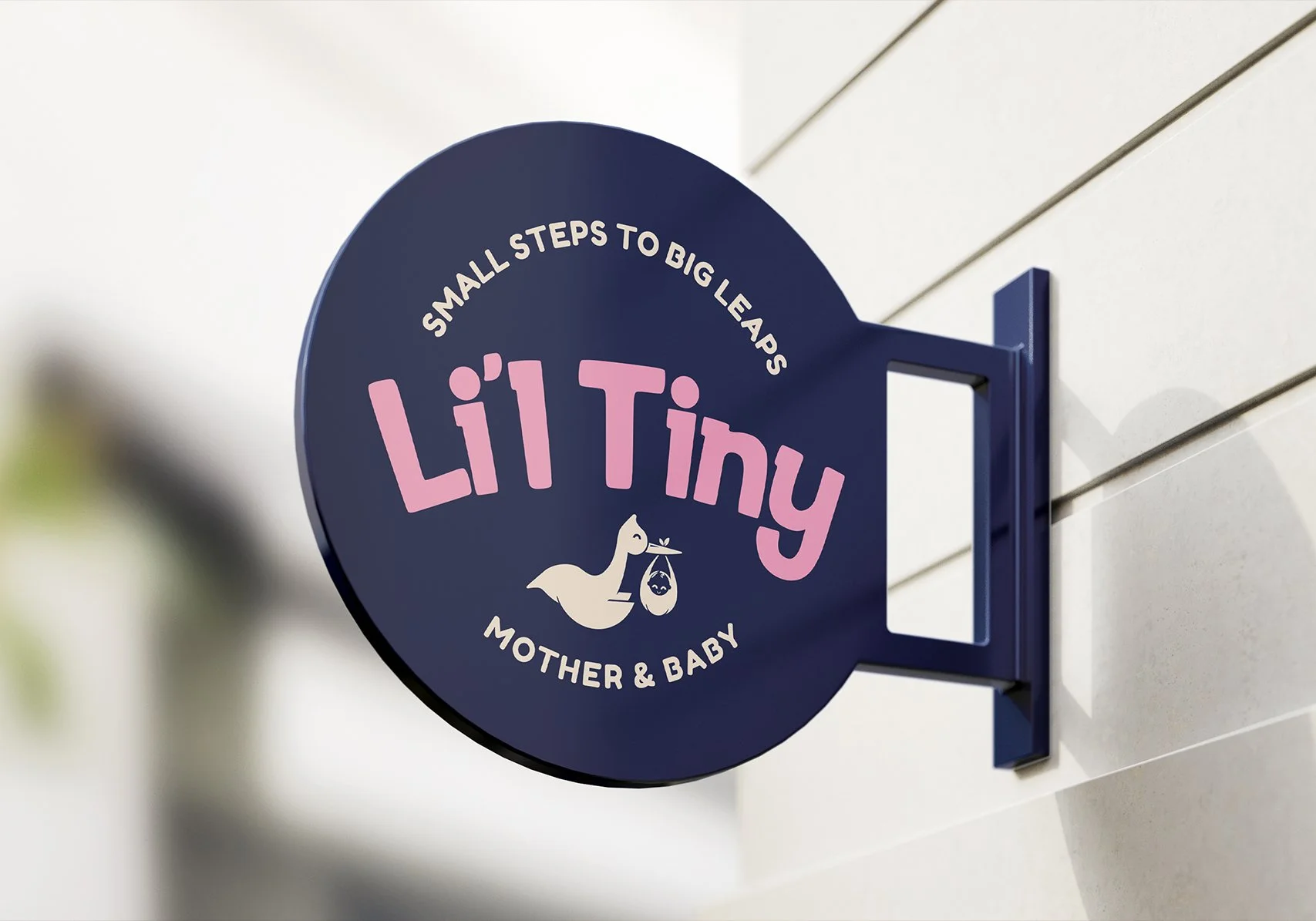
![A round dark blue sign mounted on a wall that says "Small steps to big leaps" at the top, "Li'l Tiny" in large pink letters in the middle, and "Mother & Baby" at the bottom, with a graphic of a kangaroo carrying a baby in a pouch.]()
Li'l Tiny
-
![Logo for Ethani's Gourmet Foods over a background of fresh produce and vegetables at a market or grocery store.]()
Ethan's Gourmet
-
![Computer screen displaying a promotional webpage for a zombie-themed survival event titled 'Survive the Night' with zombie images in the background, menu options, and registration buttons.]()
Race The Dead
-
![Black t-shirt hanging on black hanger with a label that reads 'DISTRICTEE' inside the neckline.]()
Districtee
-
![Sign for Hongdae Oppa, a Korean dining house, hanging in a restaurant with green walls and hanging lights.]()
Hongdae Oppa