Leong Lawrence
Client
Leong Lawrence
Location
Singapore
Expertise
Brand Identity
Art Direction
Logo Design
Stationary System
Status
Completed


Leong Lawrence is a top-performing financial advisor under Great Eastern with a vision to stand out from the conventional landscape of financial services. With a personal belief in trust, transition, and human connection, Leong sought to create a personal brand that was both professional and deeply meaningful. A brand that communicates who he is, not just what he does.
The Vessel Studio was commissioned to develop a bespoke identity that sets Leong apart from the typical financial branding language, while remaining polished, thoughtful, and enduring.
In an industry often defined by generic visuals and templated language, Leong Lawrence needed an identity rooted in authenticity. The strategy was simply to build something intentionally personal, informed by Leong’s name, values, and cultural heritage.
At its core, the brand would embody strength and reliability, personal connection and trust, progress and transformation. The visual metaphor that guided the project? A bridge.
The logo is a stylised, modern representation of a bridge formed by Leong Lawrence’s initials “L” and “L.”
This symbolic bridge draws inspiration from the meaning behind Leong’s Chinese surname “梁”, which literally translates to “bridge.”
The bridge represents: (Transition) Moving from one phase of life or opportunity to another, (Connection) Linking people, knowledge, and aspirations and (Stability) Strong, grounded, and supportive by design.
The form is minimal yet substantial, projecting clarity and structure. The bridge-like geometry also communicates Leong’s approach as an advisor: Supportive, strategic, and future-focused.
-
![]()
Nic's Kitchenette
-
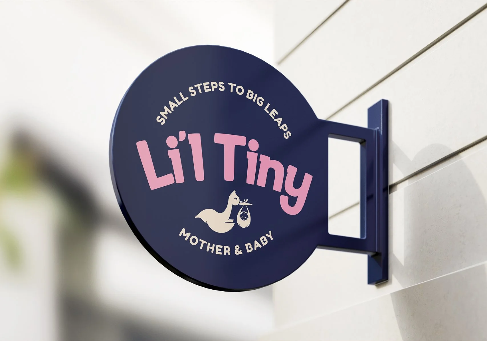
![]()
Li'l Tiny
-
![]()
Ethan's Gourmet
-
![]()
Race The Dead
-
![]()
Districtee
-
![]()
Hongdae Oppa
-
![]()
SpongeBob Run
-
![]()
Hwa Chong International School
-
![]()
Anjali's Curry
-
![]()
Willet Partners
-
![]()
Supermono
-
![]()
LevelUP
-
![]()
The Jade Cask
-
![]()
White Clinic
-
![]()
YOLO Run
-
![]()
Salesforce
-
![]()
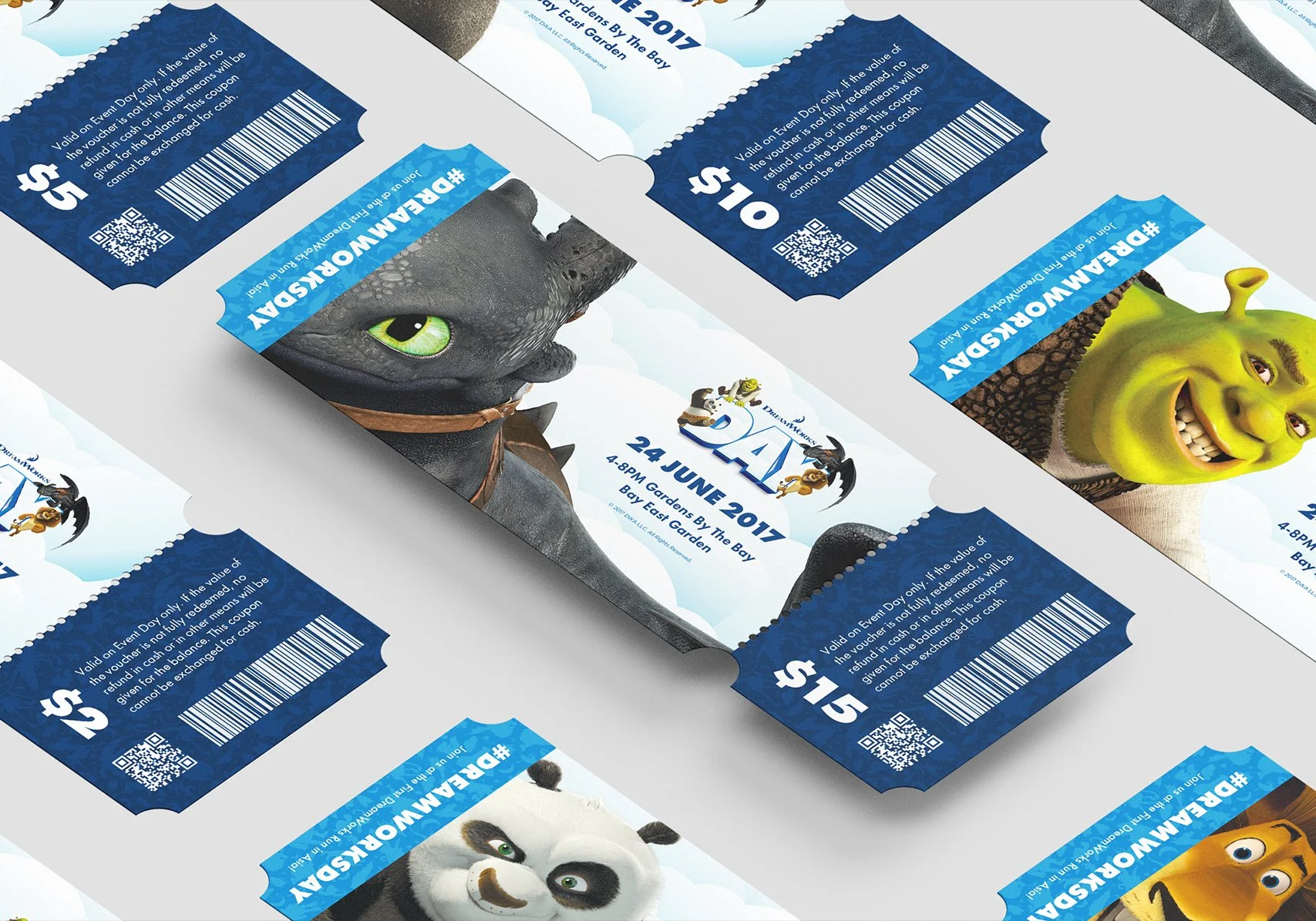
DreamWorks Day
-
![]()
Run Free
-
![]()
Leong Lawrence